Intellibus App
How did it start??
For my Graphic Design term paper graduation I made a deal with and IT student, by making his term paper an app and mine the app's design. Rodrigo started the development while I was making case study and asking for the screens that were ready.
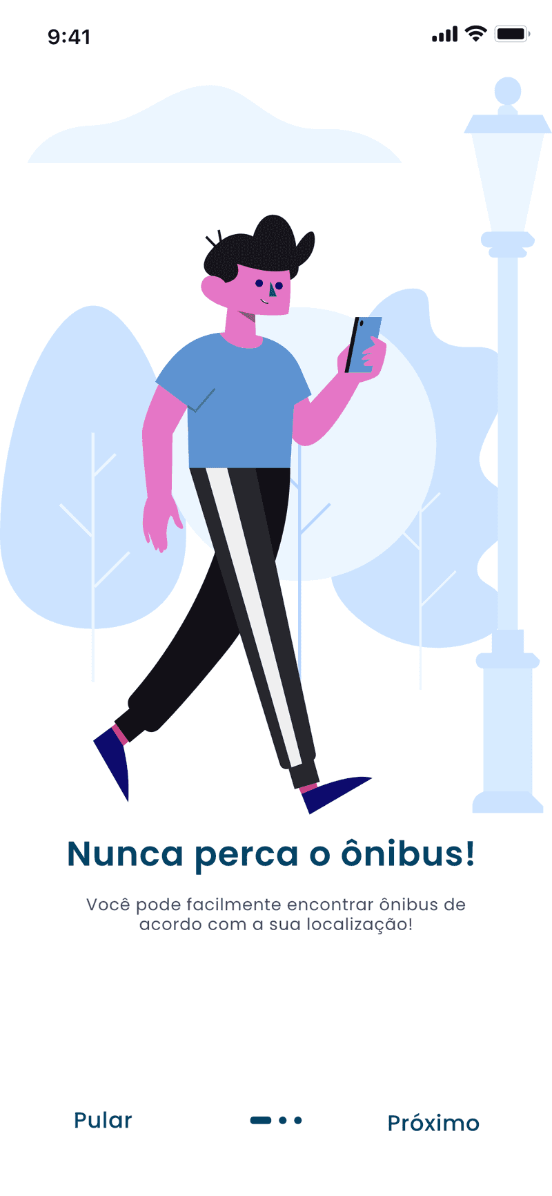
So far, the app was been made to fill the regional mobility gap, and be a reference for the public. Having features like:
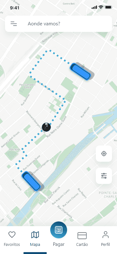
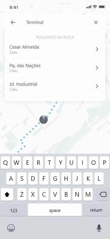
- consultation of lines and schedules,
- real time traking vehicles close to the user,
- complete route for the bus driver,
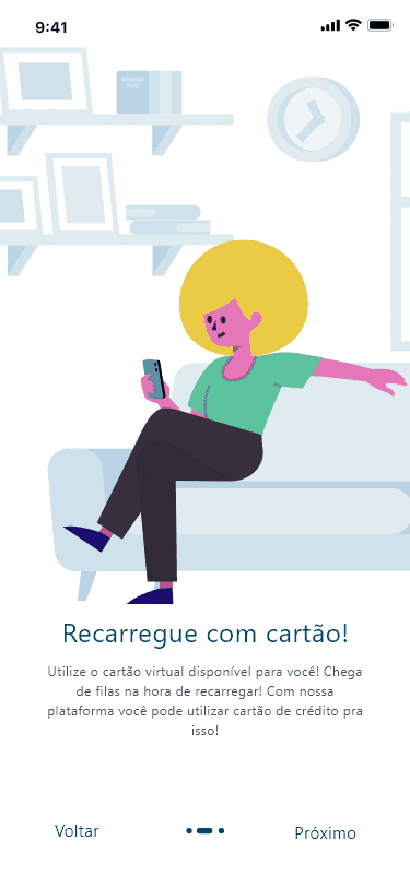
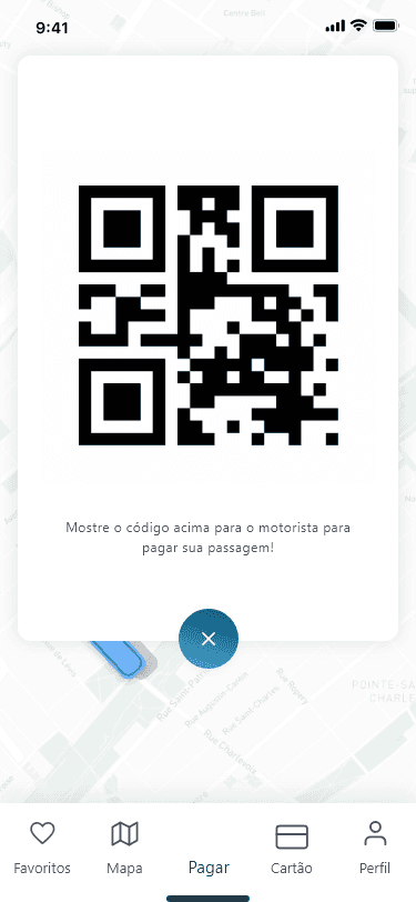
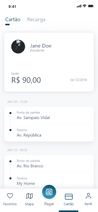
- balance check and recharge with virtual card.
How is the progress?
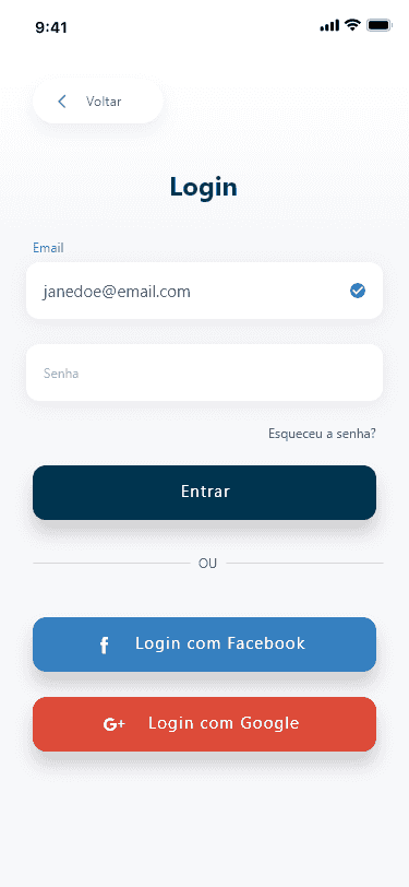
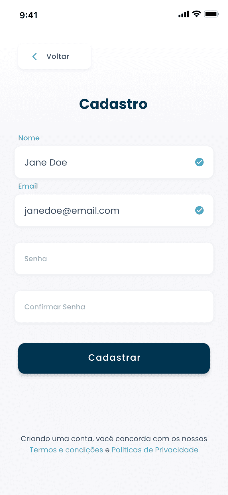
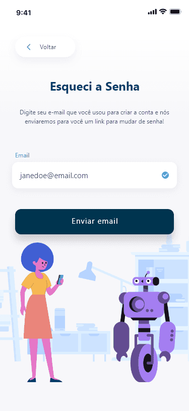
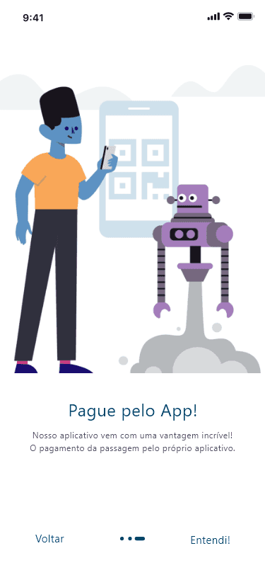
The Intellibus makes heavy use of data generation and provision, such data must be presented in a coherent and concise manner. The application's interface shows this data in the best possible way, making its purpose clear and objective.
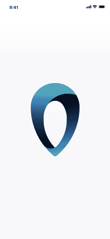
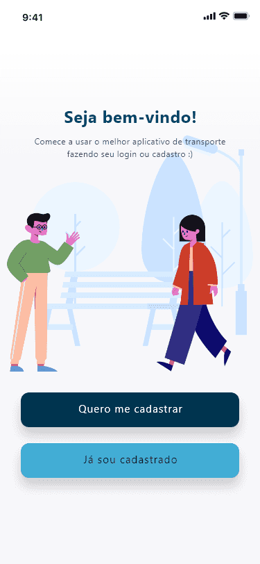
With approximately 15 screens, the project conveys through its colors, shapes, illustrations and typography, the concepts of modernity and intelligence.
Who is it for?
The target public of the project is composed of two groups: the user of public urban transport and the company responsible for it.
As a two-way street, both audiences depend on each other for the application to perform at its best. If the transport user does not see any benefit in their day-to-day use of the application companies will not have the necessary data to operate, making the application a dead product.
Using the application effectively, companies will have more autonomy in decision making, uncomplicating its method of providing information to its users, and the public that uses transport will have more practicality when making their daily trips, thus making their day-to-day life simplified.
It is unique?
Speaking of competitiveness, Brazil does not lose. A 2016 survey by the company Cheetah Ad Platform, revealed that Brazil, together with Mexico and the United States, has the most competitive market for applications.
Brazil is still in the lead in terms of greater user engagement, where Brazilians on average have 29.23 apps and interact monthly with 53.62.
Leaving research aside, meet some of our competitors:
What are the benefits?
The application is the only one in the region with this proposal, having the only competitors operating in large cities and/or being used with little regularity by the population. In addition, the project's target audience ranges from the service contracting company as the transport user, also having as a strong point the use of artificial intelligence to obtain data for companies.
It has flaws?
Unfortunately (or fortunately) like every good story we reached the climax. As it is an urban mobility application, it will not be the only one, with several large national and international competitors. The startup is new and its market reach is smaller, because the small team that only has a back-end developer (Rodrigo) and a front-end developer and designer (author), there will be no way to focus on marketing, thus lacking someone focused only on that area.
What's new?
Now talking about novelty one of the main trends in the technology market today is the use of Artificial Intelligence that automates and simplifies the collection of data by companies, facilitating decision-making. In addition, in August 2020 the General Data Protection Law comes into force, which guarantees the user's right to know the purpose of their data, that is, systems that do not adapt to the new rules will fall into disuse.
The Project
Study
The color pallete is simple and with lots of beautiful blues and yellow. Your mind is about to trick you and ask: "wow thats a lot of blue, why is that?". And the answer is also simple: It's the most favorite color of all colors - according to a book by Eva Heller.
And maybe (again) your mind next question is: "what is the yellow for?". Well it is the contrast the emphasis, shyly (a bit) appears to say a smiley and glad hello, joyful and optimistic. Yellow is the color of youth and fun, the proof of this is our experience with the sun it shines and cheers us up it's invigorating.
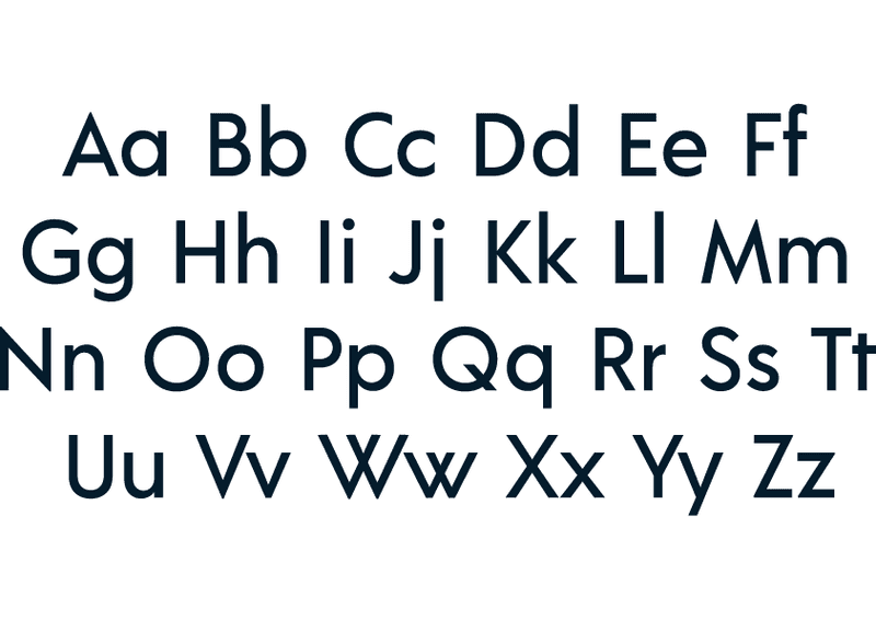
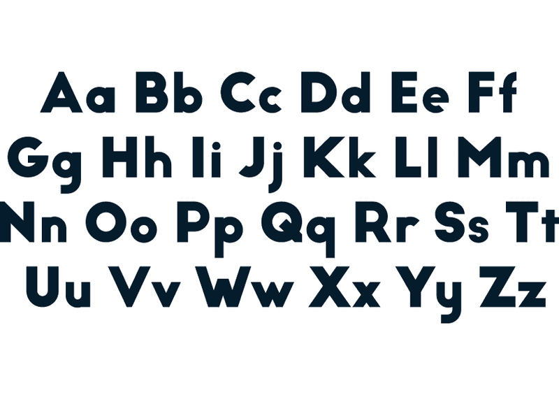
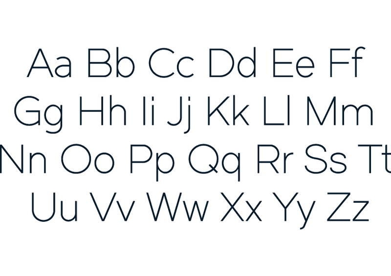
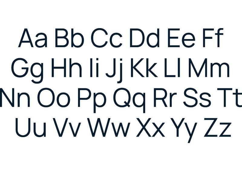
Besides the colors the app needs some typography right? Here are some of the pre selected ones:
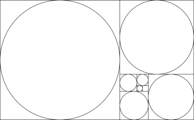
After typography and color study it was time to take some action and start sketching. Below are the first concept of the app's logo:
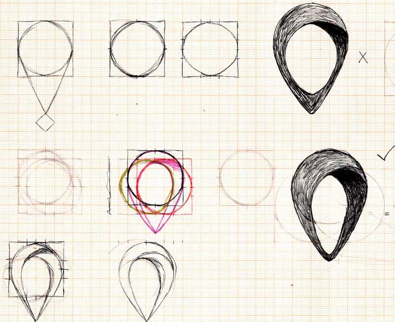
So, what do you think of the proposals? As you may have noticed, the drafts came before the final execution of the logo, and its execution was the same as proposed in the draft. As a friend of mine told me:
Its coolwhenthe executionmatchesthe ideia
The Final Project
The downside
Unfortunately the project was not completed. Soon after my graduation came the pandemic and many things changed that postponed the idea of continuing this project. But don't worry, you'll still see a lot of projects around here, so don't forget to come back often to check it out. 😉

